Timeless Fusion of Spirit, form, and Identity
Crafted with fluid, brushstroke forms, the mark becomes a living symbol—capturing the seamless navigation between space and soul, form and spirit.
The curved form (Laam) symbolizes the womb, the spiral of becoming, and the inward flow of receiving—it simultaneously forms the bowl of the letter “b”
The upright form (Alif) embodies presence, truth, and spiritual alignment—serving as the stem of “b”
The small dot signifies the soul—the center of awareness, stillness, and awakening—echoing both the whirling dervish’s Sema and the “i” in
BEING
The freeform brushstrokes introduce an organic flow—honoring both the creative energy of healing and the mindful precision of design
Color Philosophy:
Deep Sky Blue speaks to expansion and clarity—the boundless sky under which dreams and structures are born (Spaces)
Coral Earth Tone grounds the mark—rooting it in stability, warmth, and the nurturing strength of the earth
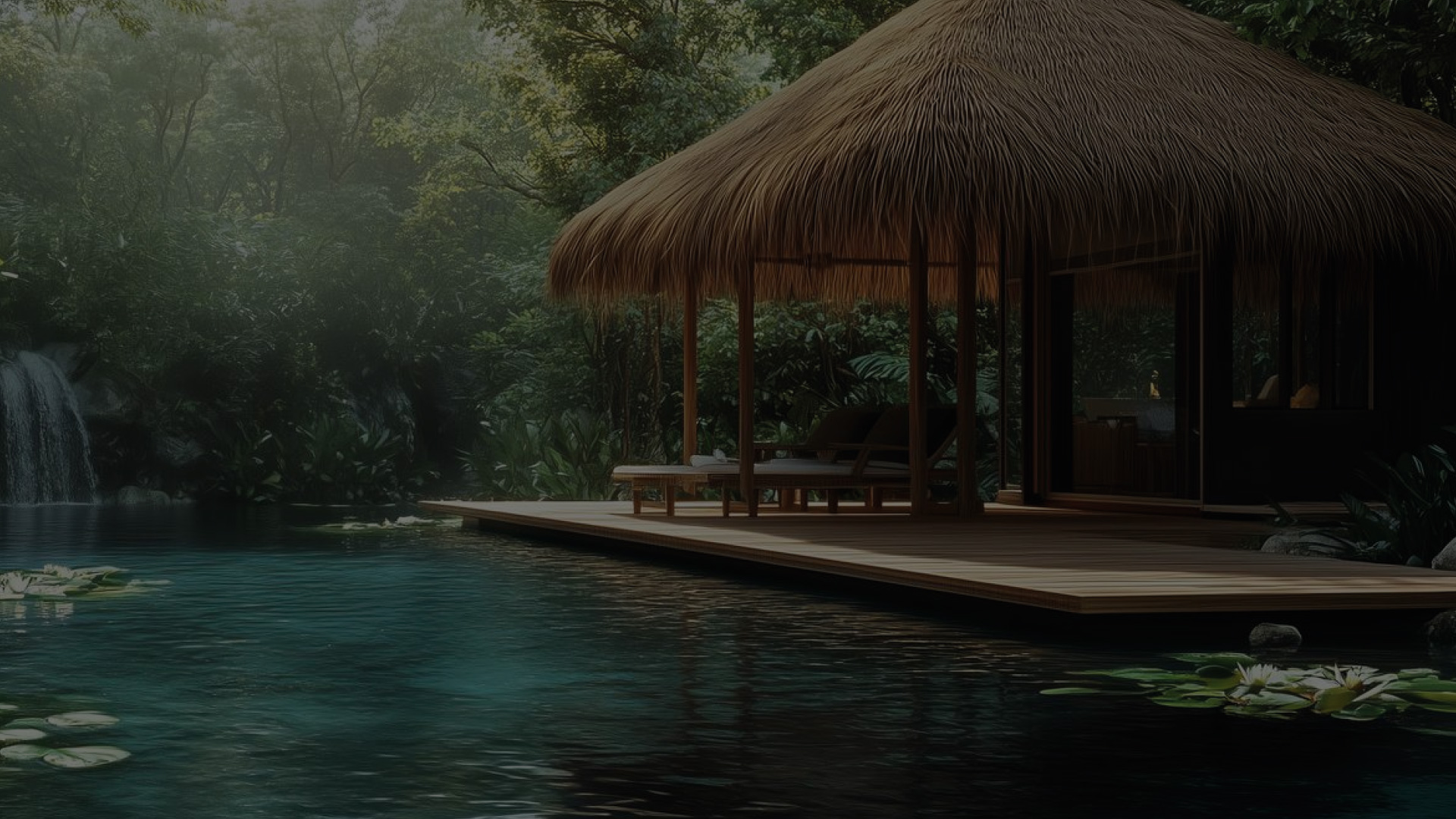
These three natural elements—sky, water, and earth—mirror BEING’s dual services:
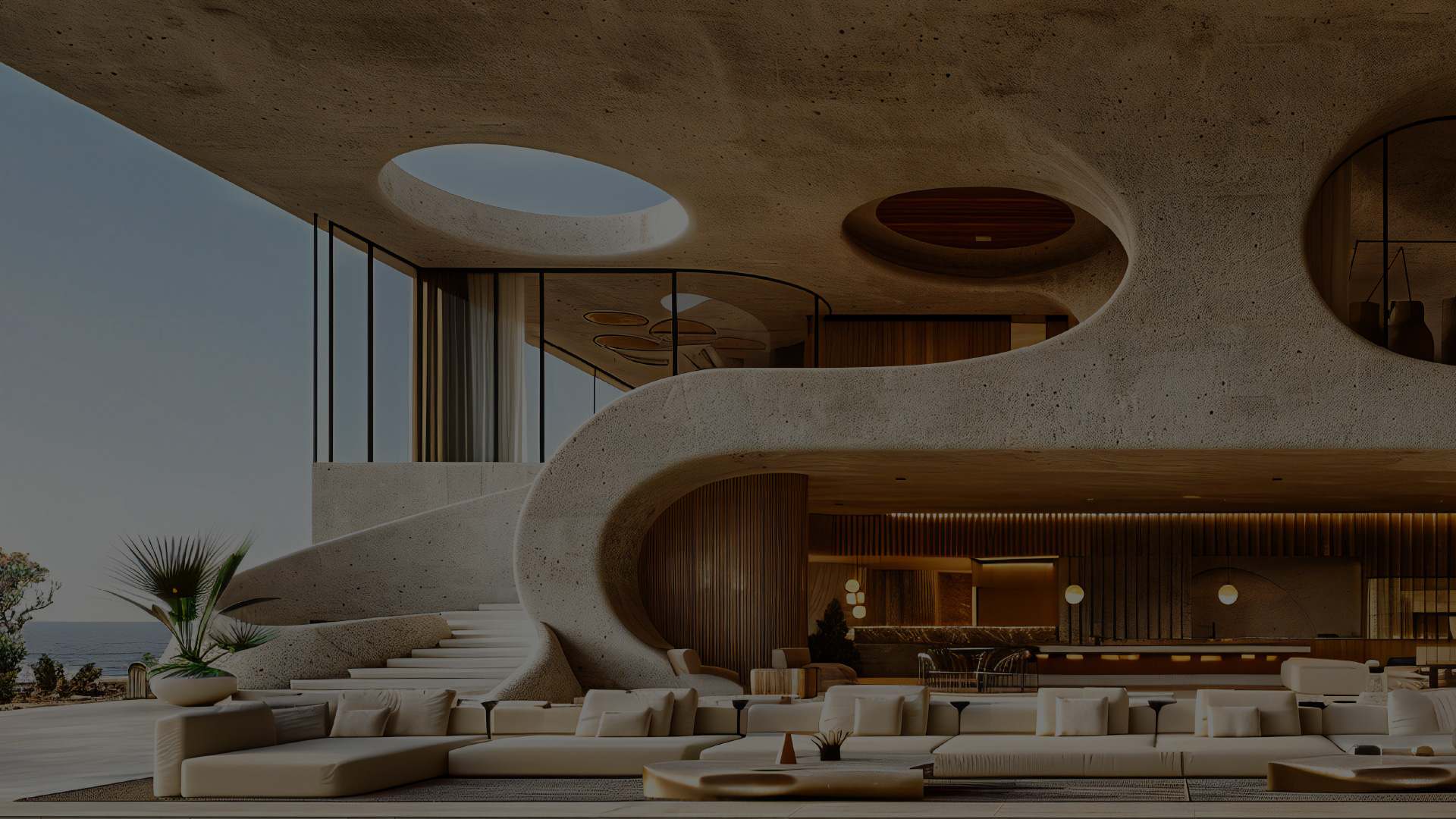
Designing soulful spaces that connect with the natural world (BEING | Spaces)
Guiding inner journeys back to emotional balance and wholeness (BEING | Within)
The logo becomes a visual odyssey:
- From the unseen inner spiral to the upright clarity of truth
- From the infinite womb of creation to the grounded presence of living
- From elemental flow to spiritual stillness
- Always returning to the whole
A brand that doesn’t just design spaces or heal souls, but cultivates sanctuaries where presence meets poetry, and the art of being becomes a timeless journey.


